1. Overview
This documentation introduces the basic skinning tools used by the P.I.S.D. Layers. Applications and games are free to use these tools as they wish. Therefore they may not implement all the functionality detailed here. There are specific notes at the end of this document on some individual applications using the P.I.S.D. skinning system.
2. Image Box
An image box is a rectangular area of specified size made by combining one or more images. An image box uses a set of image files with matching file names. Image Boxes load a set of 1,3 or 9 images which it then tiles or re sizes to produce the box of the requested size. The file names match the following pattern:
<base_name>_<ibox_position>.<image_filetype>The base name can be anything you like and is used to identify the members of the image box. The image box position identifies where in the box the image belongs. This is dependant on the number of images that make up the set. The system automatically works out which kind of image box to use by the files it finds. Therefore it is important to make sure you have all the images that make up the image box otherwise it will not load. Image file type can be any supported image format such as JPG or PNG. It is recommended to use PNG rather than JPG as a JPG image slightly distorts the image and can create strange effects when the image box is drawn.
2.1. Image Box - 9 Way
This is the best image box to use as it will re size in both directions with little or no distortion. The files required for a 9-way image box are:
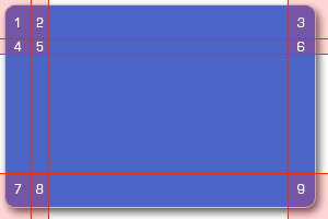
1. <base_name>_top_left.png
2. <base_name>_top_mid.png
3. <base_name>_top_right.png
4. <base_name>_mid_left.png
5. <base_name>_mid_mid.png
6. <base_name>_mid_right.png
7. <base_name>_bottom_left.png
8. <base_name>_bottom_mid.png
9. <base_name>_bottom_right.png
2.2. Image Box - 3 Way
Horizontal image boxes work best when their height does not change very much. They will scale horizontally with little or no distortion but if the height varies by more than a few pixels it will start to distort.
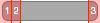
1. <base_name>_left.png
2. <base_name>_mid.png
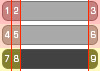
3. <base_name>_right.pngVertical image boxes work best when their width does not change very much. They will scale vertically with little or no distortion but if the width varies by more than a few pixels it will start to distort.
<base_name>_top.png
<base_name>_mid.png
<base_name>_bottom.png
2.3. Image Box - Single Image
Single image, image boxes are not that helpful as any change in size will cause distortion. They should only be used when you are confident the object is of a fixed size and splitting the image up into 9way or 3way tiles is too complex or unnecessary.
2.4. Image Box - Auto Sliced Single Image
To make life easier the image box system can split a single image into component images automatically. This can simplify the skinning process while retaining the flexibility of the image box resizing system. This will not work in cases where the split is not symmetrical or requires custom splitting positions. It is intended to work in most cases as a convenient way to produce and handle image box images. By naming the single image as shown below you will instruct the system to chop up your image into the corresponding image box type as detailed above.
<base_name>_9way.png
<base_name>_3wayh.png
<base_name>_3wayv.png
3. Button Image Boxes
In the case of buttons you can specify an image box for each state the button can have. The following image boxes are required to draw this object:
- <base_name>_up_<ibox_info>
-
The button is in its natural idle state.
- <base_name>_down_<ibox_info>
-
The button is pressed by either the mouse or keyboard shortcut.
- <base_name>_<ibox_info>
-
Used for up and down states if both fail to load.
The following image boxes are optional:
- <base_name>_disabled_<ibox_info>
-
The button is not functional.
- <base_name>_active_up_<ibox_info>
-
The button is not pressed and in its active state.
- <base_name>_active_down_<ibox_info>
-
The button is pressed by either the mouse or keyboard shortcut and in its active state.
- <base_name>_active_disabled_<ibox_info>
-
The button is not functional and in its active state.
- <base_name>_active_over_<ibox_info>
-
Mouse is hovering over button and in its active state.
- <base_name>_highlighted_<ibox_info>
-
Button is highlighted.
- <base_name>_over_<ibox_info>
-
Mouse is hovering over button.
- <base_name>_flashing_<ibox_info>
-
If provided, the button alternates with this image box at regular intervals.
- <base_name>_dragging_<ibox_info>
-
If provided, the button uses this image box when it is being dragged. If this is not supplied a semi-transparent image of the current button state is used.
For example, if you want to create a set of images for a button when the mouse if hovering over it using a 9-way image box, you need the following images:
<base_name>_over_top_left.png
<base_name>_over_top_mid.png
<base_name>_over_top_right.png
<base_name>_over_mid_left.png
<base_name>_over_mid_mid.png
<base_name>_over_mid_right.png
<base_name>_over_bottom_left.png
<base_name>_over_bottom_mid.png
<base_name>_over_bottom_right.png
You can then repeat the above replacing "over" with "down" to create the images to show a button in the down state (i.e. pushed by the user clicking on it).
4. Style Sets
The skinning system is built around style sets. Each one details a look that can be applied to any on screen object. They are simple text files allowing you to link to images, set spacing and a selection of other visible settings.
Style sets can work in two different ways, graphical or API mode.
In API mode, the object defined by the style set will use API drawing routines to render the object. These are such tools as draw_line() and draw_rect(). This creates a very fast but rather simple, dated look. You can use the style set to control the colours used to draw the object and a few simple settings.
In graphical mode, image box(s) are used to render the object. This is achieved by setting the "image_filename" field in the style. This is used as the <base_name> field when loading in image boxes. When in graphical mode the API drawing information is not used and can be ignored.
Here are the supported settings for a style set:
- name
-
The name of this style set. It can be used by the application to locate this style set. It does not have to be unique, however if the application searches for the name and there are two identical entries it may not find the right style set.
- image_filename
-
The base name of the image box(s) used to draw the object. If this is valid the object is drawn in graphical mode, otherwise API mode is used.
- image_path
-
The path where the image box(s) are located. See Disk Paths for an explanation of path entries.
- shading_type
-
TDB
- fg_colour
-
The foreground colour of the object. In most cases this is the colour of text on the object. See Colour Formats for explanation of valid colour entries.
- bg_colour
-
The background colour of the object. See Colour Formats for explanation of valid colour entries.
Only used when object is drawn in API mode - fading_colour
-
This colour is blended/faded with the background colour of the object when the ssf_hfading or ssf_vfading flags are set. See Colour Formats for explanation of valid colour entries.
Only used when object is drawn in API mode - highlight_colour
-
TDB
- highlight_text_colour
-
TDB
- active_colour
-
TDB
- active_text_colour
-
TDB
- mouse_over_colour
-
TDB
- mouse_over_text_colour
-
TDB
- flashing_colour
-
TDB
- flashing_text_colour
-
TDB
- underline_colour
-
TDB
- visible
-
TDB
- shading_flags
-
TDB
- font_id
-
TDB
- font_x_sz
-
TDB
- font_y_sz
-
TDB
- font_name
-
TDB
- border_left_gap
-
TDB
- border_right_gap
-
TDB
- border_top_gap
-
TDB
- border_bottom_gap
-
TDB
- cell_left_gap
-
TDB
- cell_right_gap
-
TDB
- cell_top_gap
-
TDB
- cell_bottom_gap
-
TDB
- x_spacing
-
TDB
- y_spacing
-
TDB
- scrollbar_button_width
-
TDB
- scrollbar_slider_width
-
TDB
- grid_scrollbar_width
-
The width of the side scrollbar if present.
Only used by grid objects - grid_two_tone_value
-
The percentage by which each alternate grid row is darkened. I negative percentage can be used to lighten the alternate rows. The ssef_grid_two_tone flag must be set for this value to be used.
Only used by grid objects - ssf_draw_border
-
TDB
- ssf_indent_border
-
TDB
- ssf_outstanding_border
-
TDB
- ssf_hfading
-
TDB
- ssf_vfading
-
TDB
- ssf_darkened_background
-
TDB
- ssf_left_justify_text
-
TDB
- ssf_right_justify_text
-
TDB
- ssf_top_align_text
-
TDB
- ssf_bottom_align_text
-
TDB
- ssf_use_text_colour_for_outline
-
TDB
- ssf_shadow_text
-
TDB
- ssf_inset_text
-
TDB
- ssf_chiseled_text
-
TDB
- ssf_disabled
-
TDB
- ssf_icon_left
-
TDB
- ssf_icon_right
-
TDB
- ssf_icon_top
-
TDB
- ssf_icon_bottom
-
TDB
- ssf_icon_attach_to_text
-
TDB
- ssf_wrap_text
-
TDB
- ssf_dont_resize_image
-
TDB
- ssef_invert_vfading_on_press
-
TDB
- ssef_indent_when_active
-
TDB
- ssef_left_arrow
-
TDB
- ssef_right_arrow
-
TDB
- ssef_up_arrow
-
TDB
- ssef_down_arrow
-
TDB
- ssef_auto_depress
-
TDB
- ssef_auto_activate
-
TDB
- ssef_dont_mask_click
-
TDB
- ssef_sb_horizontal
-
TDB
- ssef_sb_with_buttons
-
TDB
- ssef_te_password
-
TDB
- ssef_grid_fix_top_row
-
Set to 1 for a fixed top row that does not scroll, otherwise set it to 0. This can be very useful for column headings so they are always visible.
Only used by grid objects - ssef_grid_two_tone
-
Set to 1 to make the grid darken every alternate row by grid_two_tone_value percent, otherwise set it to 0.
Only used by grid objects - ssef_grid_type_lines
-
Set to 1 to make the grid draw line by line, otherwise set it to 0. The grid background is calculated line by line.
Only used by grid objects - ssef_grid_type_cells
-
Set to 1 to make the grid draw cell by cell, otherwise set it to 0. The grid background is calculated cell by cell.
Only used by grid objects - ssef_grid_scroll_by_line
-
Set to 1 to make the grid scroll down a row at a time. Set to 0 to make the grid scroll one pixel at a time.
Only used by grid objects - ssef_grid_no_scrollbar
-
Set to 1 to stop the grid automatically creating a scrollbar when the number of rows exceeds the space to draw. Set to 0 to make the grid dynamically create a scrollbar as needed.
Only used by grid objects - ssef_grid_only_draw_used_lines
-
Set to 1 to stop the grid drawing unused rows at the end of the data. Set to 0 to make the grid draw blank lines after the data until the end of the grid.
Only used by grid objects - ssef_grid_dont_shorten_scrollbar
-
Set to 1 to make stop scrollbar being shortened below the fixed top row, otherwise set it to 0.
Only used by grid objects - ssef_pb_only_draw_bar
-
TDB
- ssef_pb_vertical
-
TDB
- ssef_pb_no_shading
-
TDB
- ssef_pb_position_text_on_bar
-
TDB
- ssef_pb_draw_alt_percentage
-
TDB
- ssef_fm_hide_scrolling_arrows
-
TDB
- sssf_retain_width
-
TDB
- sssf_retain_left_border
-
TDB
- sssf_retain_right_border
-
TDB
- sssf_retain_x_font_size
-
TDB
- sssf_retain_height
-
TDB
- sssf_retain_top_border
-
TDB
- sssf_retain_bottom_border
-
TDB
- sssf_retain_y_font_size
-
TDB
5. Graphical Button Using Style Sets
In order to define a graphical button using a style set you first need to create the required image box sets for each button state you want. In this example we will create a button using 3-way Horizontal image boxes for the up, down and over button states. We will use a base name of "my_button", but this could be anything we like that identifies this buttons images. So that means we need the following images:
1. my_button_up_left.png
2. my_button_up_mid.png
3. my_button_up_right.png
4. my_button_over_left.png
5. my_button_over_mid.png
6. my_button_over_right.png
7. my_button_down_left.png
8. my_button_down_mid.png
9. my_button_down_right.png
Assuming the above images are in a sub folder named "ibox_images", you would then make the following changes to the style set to tell it which images to use:
image_filename
        my_button
image_path
        $HERE/ibox_images
Now when this style set is used to skin a button, the images you created above will be used to draw that button.
6. Grid Style Set
Grids are often used to display tables of data. It is often hard to read a grid if the background is one uniform tone or colour. There are a number of tools to change the visual appearance of grids to make them easier to see.
ssef_grid_type_cells and ssef_grid_type_lines can make the lines stand out by changing the way the grid draws its background. This is not suitable if you want to round the corners of your grid as it would round each cell or each line respectively.
You can use ssef_grid_two_tone and grid_two_tone_value to darken each alternate line. If you wish to lighten the line you can supply a negative two tone value. This easily adds a subtle line effect that can help the visual impact of a grid.
The last option is only available if it is supported by the application you are skinning. It is possible to supply separate style sets for alternate rows. So all the even numbered rows use one style set and the odd numbered rows use another style set. This gives you the most graphical control, however not all applications support this method.
All there methods above work in conjunction with each other. This allows you to combine the effects to create the desired look..
7. Colour Formats
There are three supported colour formats, RGB, HSL and CMYK. RGB is how the graphics hardware works and therefore is used internally by the system. This means both HSL and CMYK need to be converted which can introduce slight errors. This means you should consider using the RGB format in preference to HSL and CMYK.
The CMYK format is designed around printer hardware, specifying the amount of each coloured ink needed to create the desired colour. This means the RGB and CMYK systems are very different in how they combine colours. For example all colours combined with the CMYK system creates black, but all colours combined with the RGB system creates white. Conversion between these different systems is only approximate as a result, so any colour specified as CMYK is not going to be very accurate.
The skinning system uses a full 8-bit alpha channel which is pre-pended to the three supported colour formats. So RGB becomes ARGB, where the A indicates the alpha value. An alpha channel of zero means the colour is transparent, with an alpha channel of the maximum range being solid.
In order to make things simpler the system understands four different number ranges. They are all the same internally so feel free to use whichever number range you feel most comfortable using.
7.1. Using hexadecimal (Base16)
- #010203
-
This specifies a colour using RGB format in hexadecimal where the alpha is solid, red is 0x01, green is 0x02 and blue is 0x03.
NOTE: This is a special case and is included for compatibility with HTML colour specifications. - #FF010203
-
This specifies a colour using ARGB format in hexadecimal where the alpha is 0xFF, red is 0x01, green is 0x02 and blue is 0x03.
- #AHSL FF010203
-
This specifies a colour using AHSL format in hexadecimal where the alpha is 0xFF, hue is 0x01, saturation is 0x02 and level is 0x03.
- #ACMYK FF01020304
-
This specifies a colour using ACMYK format in hexadecimal where the alpha is 0xFF, cyan is 0x01, magenta is 0x02, yellow is 0x03 and black is 0x04.
7.2. Using Percentage (0-100)
- %100,1,2,3
-
This specifies a colour using ARGB format in percent where the alpha is 100%, red is 1%, green is 2% and blue is 3%.
- %AHSL 100,1,2,3
-
This specifies a colour using AHSL format in percent where the alpha is 100%, hue is 1%, saturation is 2% and level is 3%.
- %ACMYK 100,1,2,3,4
-
This specifies a colour using ACMYK format in percent where the alpha is 100%, cyan is 1%, magenta is 2%, yellow is 3% and black is 4%.
7.3. Using Decimal (0-255)
- &255,1,2,3
-
This specifies a colour using ARGB format in the range 0-255 where the alpha is 255, red is 1, green is 2 and blue is 3.
- &AHSL 255,1,2,3
-
This specifies a colour using AHSL format in the range 0-255 where the alpha is 255, hue is 1, saturation is 2 and level is 3.
- &ACMYK 255,1,2,3,4
-
This specifies a colour using ACMYK format in the range 0-255 where the alpha is 255, cyan is 1, magenta is 2, yellow is 3 and black is 4.
7.4. Using Normalised (0.0-1.0)
- @1.0,0.1,0.2,0.3
-
This specifies a colour using ARGB format in the range 0.0-1.0 where the alpha is 1.0, red is 0.1, green is 0.2 and blue is 0.3.
- @AHSL 1.0,0.1,0.2,0.3
-
This specifies a colour using AHSL format in the range 0.0-1.0 where the alpha is 1.0, hue is 0.1, saturation is 0.2 and level is 0.3.
- @ACMYK 1.0,0.1,0.2,0.3,0.4
-
This specifies a colour using ACMYK format in the range 0.0-1.0 where the alpha is 1.0, cyan is 0.1, magenta is 0.2, yellow is 0.3 and black is 0.4.
8. Disk Paths
The core design of the P.I.S.D. Layers aims to remove platform specific knowledge. One of the areas where this is most obvious is disk paths. Each OS has its own way to identify and handle disk drives and devices. For example Microsoft Windows uses driver letters (c:\, d:\, etc) which are not understood on Apple Mac or Linux. The P.I.S.D. Layers handle this by creating a set of useful locations the core of which are relative to the application location. This allows paths to have a sensible meaning on all the platforms supported by the P.I.S.D. Layers. That way a path saved on one platform has a good chance of working on another.
The locations can be considered equivalent to drive specifications. You can append sub-folders using the / character. Do not use a the windows \ character as it is not supported. So to set the path to an installed data file in the sub folder "my-path" you should use "$APPDATA/my-path".
Here are the known folder locations:
- $APP
-
location of the running program
- $APPDATA
-
system specific location of shared, installed, read only data (set to $APP/data)
- $USERAPP
-
location of user specific applications that can be installed by the current user. (if folder not found it is set to $APP)
Windows: CSIDL_APPDATA\<app_name> 98/XP/2k = C:\Documents and Settings\<username>\Application Data\<app_name> Vista/7 = C:\Users\<username>\AppData\Roaming\<app_name> Mac: kCurrentUserFolderType/.<app_name>/bin /Users/<username>/.<app_name>/bin Linux: ~/.<app_name>/bin - $USERDATA
-
User specific location of installed read/write data that can be installed by the current user. Data in this folder should not require the user to access it from outside the application. (if folder not found it is set to $APP/data)
Windows: CSIDL_APPDATA\<app_name> 98/XP/2k = C:\Documents and Settings\<username>\Application Data\<app_name> Vista/7 = C:\Users\<username>\AppData\Roaming\<app_name> Mac: kCurrentUserFolderType/.<app_name>/data /Users/<username>/.<app_name>/data Linux: ~/.<app_name>/data - $USERPREFS
-
system specific location of user customisable data/preferences that can be installed by the current user. Data in this folder may require the user to access it outside the application using 3rd party tools such as a text editor. (if folder not found it is set to $APP/data)
Windows: CSIDL_PERSONAL\<app_name> 98/XP/2k = C:\Documents and Settings\<username>\My Documents\<app_name> Vista/7 = C:\Documents and Settings\<username>\My Documents\<app_name> Mac: kDocumentsFolderType/<app_name>/custdata /Users/<username>/Documents/<app_name> Linux: ~/.<app_name>/custdata (Symlinked to ~/Documents/<app_name>) - $SYSAPP
-
location of system wide applications and can only be installed with root access (if folder not found it is set to $APP)
Windows: CSIDL_PROGRAM_FILES\<app_name> 98/XP/2k = C:\Program Files\<app_name> Vista/7 = C:\Program Files\<app_name> Mac: /Applications/<app_name> Linux: /opt/<app_name>/bin - $SYSDATA
-
system specific location of shared, installed, read/write data. This folder requires root access to install, but once created any user can change it. Data in this folder should not require the user to access it from outside the application. (if folder not found it is set to $APP/data)
Windows: CSIDL_COMMON_APPDATA\<app_name> 98/XP/2k = C:\Documents and Settings\All Users\Application Data\<app_name> Vista/7 = C:\ProgramData\<app_name> Mac: kSharedUserDataFolderType/<app_name>/data /Users/Shared/<app_name>/data Linux: /opt/<app_name>/data - $SYSPREFS
-
system specific location of shared, customisable, data/preferences (read/write) This folder requires root access to install, but once created any user can change it. Data in this folder may require the user to access it outside the application using 3rd party tools such as a text editor. (if folder not found it is set to $APP/data)
Windows: CSIDL_COMMON_DOCUMENTS\<app_name> 98/XP/2k = C:\Documents and Settings\All Users\Documents\<app_name> Vista/7 = C:\Documents and Settings\All Users\Documents\<app_name> Mac: kSharedUserDataFolderType/<app_name>/custdata /Users/Shared/<app_name>/custdata Linux: /opt/<app_name>/custdata - $DATA
-
location of data for running app
Set to the first found of these locations in this order:
        $USERDATA
        $SYSDATA
        $APPDATA
        $APP
NOTE: If you use this with the create_if_not_found set the system will create the first folder it can in the given order. - $TEMP
-
system specific location of temp data (if not folder not found it is set to $APP/temp)
Windows: CSIDL_PERSONAL\<app_name>\temp 98/XP/2k = C:\Documents and Settings\<username>\My Documents\<app_name>\temp Vista/7 = C:\Documents and Settings\<username>\My Documents\<app_name>\temp Mac: kTemporaryFolderType/<app_name> /private/var/tmp/*/<app_name> Linux: ~/tmp/<app_name> or /tmp/<app_name> - $ROOTx
-
root folder of drive/device x (where x is the drive/device number)
- $FONTDATA
-
location of font data (normally $APPDATA/fonts)
- $ICONDATA
-
location of icon data (normally $APPDATA/icons)
- $HERE
-
situation specific as it is passed in by the application. In the case of style sets it is the location of the current style set file.
- $BASE
-
Depreciated - Use $APP
- $INSTDATA
-
Depreciated - Use $APPDATA
9. Out Of The Park Baseball Skinning
The Out Of The Park Baseball skin does not allow the screen layout to be changed. This is deliberate due to the complexity of some of the screens. That said, there is the ability to adjust border sizes and alignment information. The style sets can be found in data/skins/ootp classic/style_sets.
Out Of The Park Baseball currently uses the "two tone" settings for grids (See Grid Style Set section) which darkens every alternate row. It does not support the alternate style set system.
Once you have changed the skinning information you will need to delete the skin cache file data/skins/ootp classic/skin.bin. When you restart the game it will take quite a bit longer to start as it reads all the skinning information and rebuilds the skin cache. On a Mac it can take a really long time as opening files can be rather slow. Or if you prefer you can select "rebuild skin" option from the game menu.
There are lots more settings and bits you can change. Its is very easy to mess things up so make sure you copy an existing skin and don’t change the supplied one so you can always get back in.
10. Title Bout Championship Boxing Skinning
Title Bout Championship Boxing uses binary skin files as they are faster to load and easier to share. However this can make modifying them a little harder. Title Bout has two command line options to assist in creating a custom skin that extracts and packs the skin data into a directory tree containing config, xml and image files:
- --extractskin
-
Copies the currently selected skin data from the binary file and into the custom_skin folder.
- --packskin
-
Packs the custom_skin data into a new skin file named "Custom Skin.bin" in the default skin folder.
In addition to the command line arguments above there are two hotkeys from version 1.3 onwards. Pressing F2 will save the current skin to the custom_skin folder in the same fasion as --extractskin. Pressing F3 will do the same as --packskin by reading in your custom skin folder and packing it into the "Custom Skin.bin". In addition it will load the newly packed skin to assist in testing. It is a good idea to only use F3 from the main page as reloading the entire skin during intense processing, such as running a fight, could have strange results.
If you wish to create your own skin it is a good idea to start from the default skin by running the game with the "--extractskin" command line option. Then change the contents of the custom_skin folder as much or as little as you wish. You can change graphics files, config files or change the objects in the page XML files under the custom_skin folder. Once you have finished modifying your skin, run the game again with the "--packskin" option to create a skin binary file. The new skin file will show up in the game options dialog as "Custom Skin" in the skin selection list box.
You can rename and upload the custom skin binary file to the Internet to share it with others. It is not a good idea to zip and upload the custom_skin folder as it is slow to load and will most likely fail to load on other systems as the paths are bound to be different.
- Tips
-
Packing and extracting skin data can take some time, especially on slower or older systems. Please be patient. Its a good idea to make small changes and test them regularly so that if something goes wrong you know where the problem lies. Be very careful when changing the XML files as they can easily break the game if you don’t know what your doing.
- Folders
-
The temporary skin folder is found in "$USERPREFS/custom_skin" and the binary skin files are found in "$USERPREFS/data/skins"
- Command Line Arguments
-
Command line arguments are historically supplied via the shell/command prompt when starting the application. However in many modern operating systems it is considered unfashionable to use a text based shell to start applications. Therefore if you are not familiar with command line arguments you can use the PISD arguments file. Create a plain text file called "pisd_args.txt" in the same folder as the application which contains one command line argument on each line. The application will read in this file as it started and treat each line as if it was passed as a command line argument. Make sure you remove this file when you have finished with the command line arguments.
11. More help
If you get stuck then please feel free to email someone@pisd.co.uk for help.